Without analyzing the actual scope of website potential, we can’t make sure our website is approaching to the full scope of audience or not. We have observed, over the past few years, a blast in the possible ways the Internet can be accessed. The choice is extremely empowering and liberating, and positively in terms of expertise, we are all getting more and more used to it, to the point that when option isn’t available, it annoys us!
At A1dezine, we endeavor to give website visitors to the websites we design the liberty to access them from whichever device they select. This means always adapting to our changing surroundings, designing for a huge amount of platforms and embracing the confront.
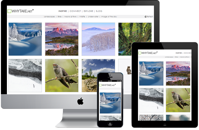
Desktop presents have, for a long time, come in a variety of sizes – and they just keep getting larger. So as an alternative of fixing our web-designs to provide for the lowest-resolution laptop, we let them grow and give large-display users with a fulfilling viewing understanding.
Working for growing displays is one thing, but mobile devices toss up the stern challenges. Not only do we have to think the simple information that there’s usually less room to work with, there are also challenges nearby interactivity – specially landscape and portrait direction, tap and swipe gestures, pop-up keyboards for text-entry, to name just a few.
The main point is, this is not just an extra hurdle we have to go through, or fight we have to win – it’s amazing and it’s bright. Your trade opportunities just went through the cover and we’re here to assist you take them. If your web design works on all the devices you can think of, then that’s a beginning of a responsive website design process – but if you’re ignoring your website visitors full and easy access to your content, deliberately or not, then that’s a shame. Call us today at 07-8346666 – we’ll always discover room for enhancement, even on the smallest of devices!